When clients focus on tile selection, they usually think about size, pattern, and finish. But grout color is just as important. In many of our NYC kitchen and bathroom renovations at NYKB, grout ends up being the quiet design decision that completely transforms the final look.
Grout can blend in. It can define a pattern. It can make a space feel modern, classic, dramatic, or soft. Choosing the right one is not an afterthought. It is a strategy.
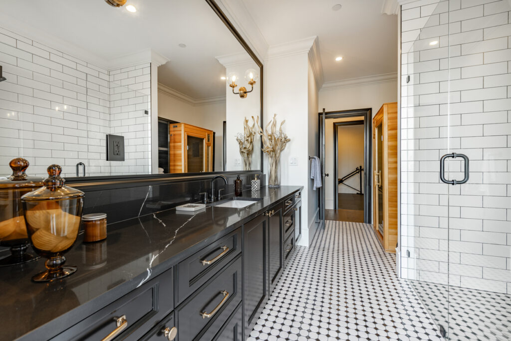
1. Why Grout Color Matters
During the bathroom remodeling, grout does more than fill joints. It visually connects or separates every tile in the room.
The right grout color can:
• Make small tiles feel cohesive
• Highlight geometric patterns
• Soften bold tile choices
• Make maintenance easier
• Change how large or busy a wall feels
In NYC apartments, especially in co-ops and condos where bathrooms are compact, grout selection can influence whether the space feels calm or visually overwhelming.
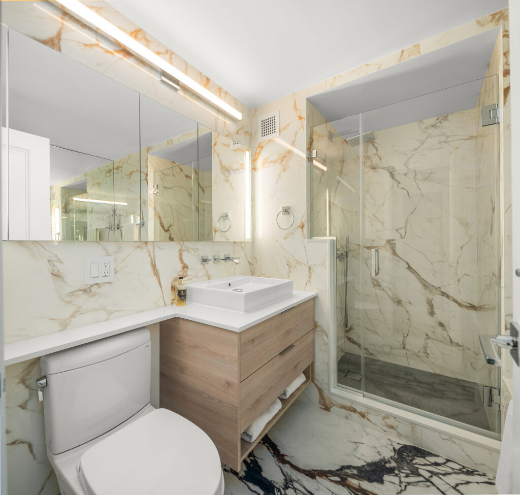
2. Matching Grout for a Seamless Look
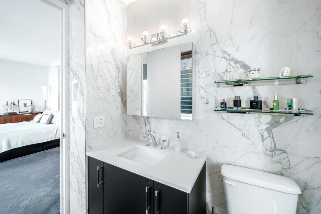
When grout closely matches the tile color, the result is clean and continuous.
This works especially well for:
• Large format porcelain slabs
• Marble walls
• Minimalist bathrooms
• Modern kitchens with simple backsplashes
Matching grout reduces visual grid lines. The tile feels like one surface rather than individual pieces. For clients who want a spa-like atmosphere in Manhattan apartments, this is often the best approach.
Pro tip: Go slightly darker than pure white. Bright white grout in high-use areas can discolor over time.
If you are planning to renovate, check our comprehensive blog about the Bathroom Remodel Checklist for NYC
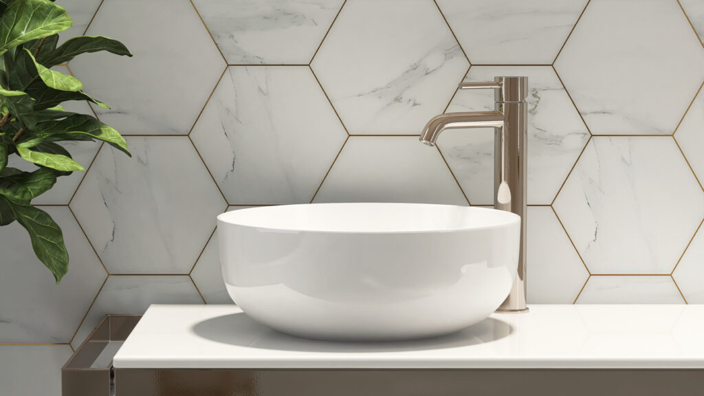
Contrasting Grout for Definition
Contrasting grout makes each tile stand out.
It is perfect for:
• Subway tile backsplashes
• Herringbone patterns
• Hexagon floors
• Statement feature walls
Dark grout with white tile creates a bold, graphic look. Gray grout with patterned tile enhances the design without overpowering it.
This is a strong choice for kitchens where the backsplash becomes a focal point.
Learn more about Bathroom Tile Ideas to Elevate Your Renovation
The Most Popular Grout Colors in NYC Renovations
Based on what we see across Manhattan and Brooklyn projects:
Light Gray
The most versatile option. It hides dirt better than white and works with most neutral tiles.
Warm Greige
Great for spaces with wood flooring or warm cabinetry. It softens cooler tiles.
Charcoal
Modern and dramatic. Ideal for patterned floors or industrial-style kitchens.
Off White
Classic, but choose carefully depending on traffic and moisture exposure.
How Lighting Affects Grout Color
Grout always looks darker once installed. Lighting can change the perception dramatically.
• Warm lighting makes gray grout appear warmer
• Cool lighting enhances contrast
• Natural light shifts tone throughout the day
We always recommend reviewing grout samples directly on the tile under the apartment’s actual lighting before final approval.
Grout Color Chart Guide: How to Read and Choose the Right Shade
Neutral Grout Family (Most Popular in NYC Renovations)
White
Clean and classic. Best for walls, not floors. Higher maintenance.
Off White / Ivory
Softer than bright white. Warmer appearance.
Light Gray
The safest and most versatile option. Works with almost any tile.
Greige
Perfect for warmer interiors with wood floors and natural tones.
Best for: Modern Manhattan apartments, transitional kitchens, minimalist bathrooms.
2. Medium Tone Grout Family
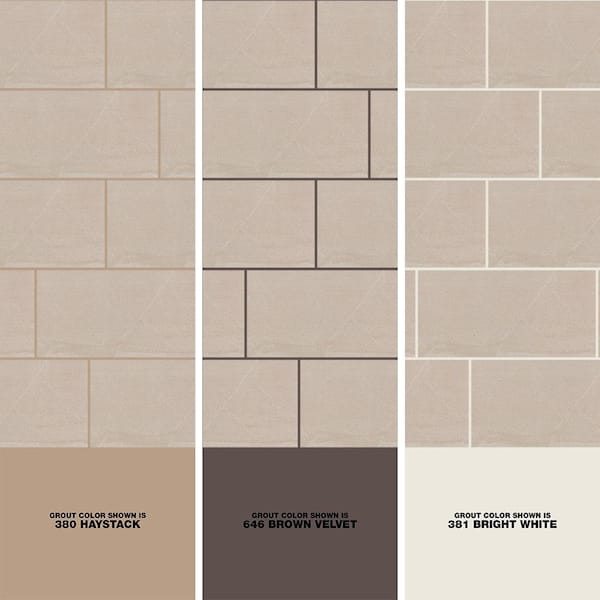
Medium Gray
Adds subtle definition without harsh contrast.
Taupe
Works beautifully with beige and warm porcelain.
Sand / Almond
Blends well with travertine and warm stone looks.
Best for: Family apartments, high traffic kitchens, rental investments where maintenance matters.
3. Dark & Contrast Grout Family
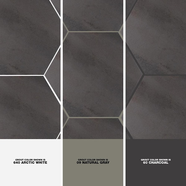
Charcoal
Modern and bold. Great for patterned floors.
Dark Gray
Defines tile layout clearly.
Black
High contrast and graphic. Works best in contemporary kitchens.
Best for: Statement backsplashes, industrial style spaces, bold powder rooms.
Ready to choose the perfect grout color for your space?
At Klein Kitchen & Bath, we guide you through every detail from tile selection to grout tone to ensure your renovation feels cohesive, timeless, and built to last.
Schedule your design consultation and let’s create something exceptional.


